

Introducing Our New Brand!
August 12, 2026 by Eileen
Centering the Arts: Our Brand Evolution
Dear friends,
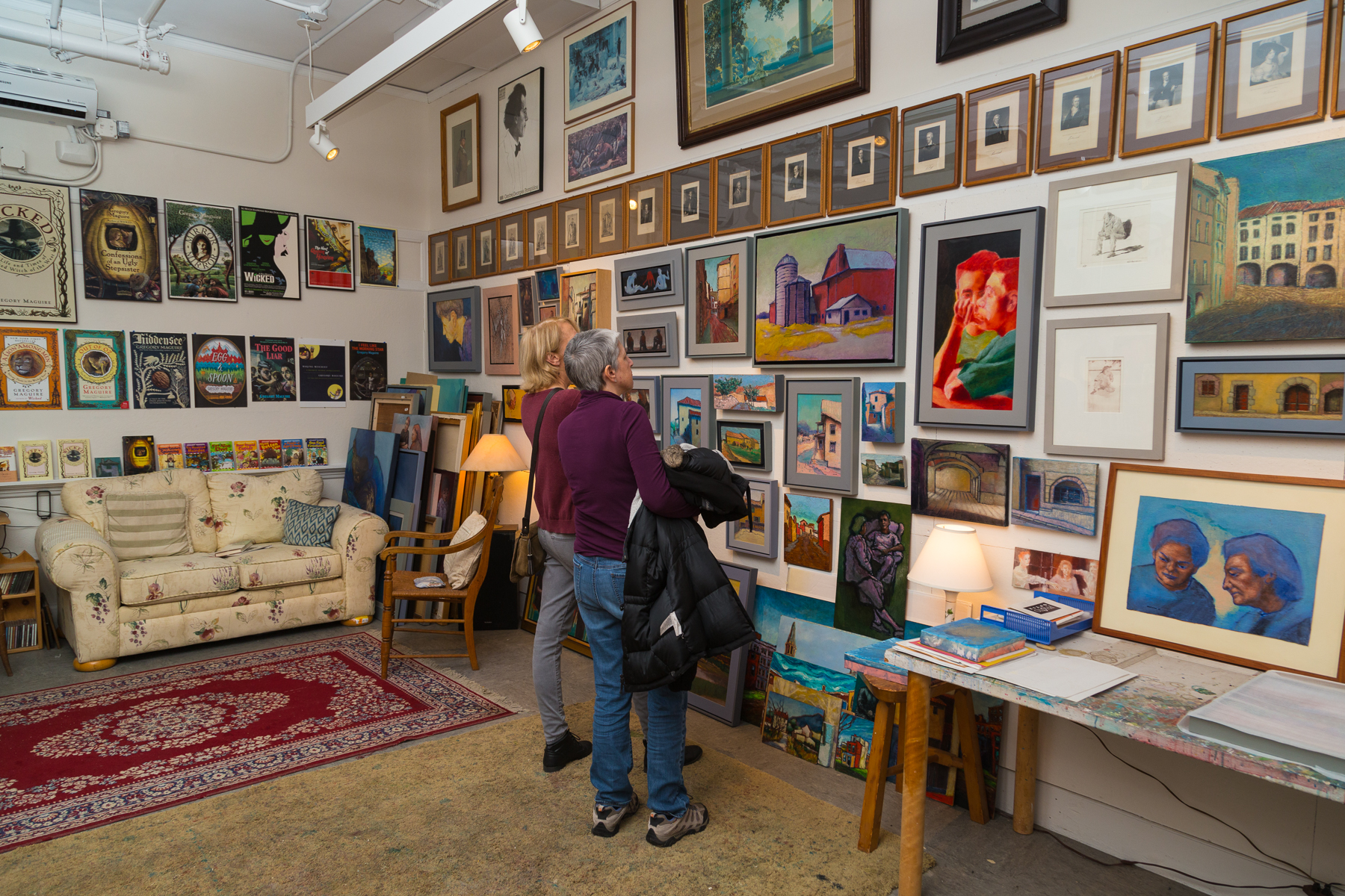
You might have experienced “The Umbrella” as a gallery, theater, workshop, classroom, gathering spot — a place where makers, audiences, and inspiration find each other… often all in a single day.
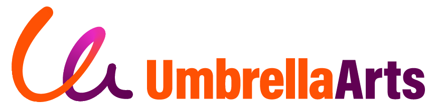
Our organization is unique and multifaceted. As we've grown, so too has the need to capture all of that in a single brand. This year, we set out to do just that, and we're excited to introduce our new brand identity:

Next week, you’ll notice some changes on our website and social media. These are the first steps to embracing the Umbrella Arts brand, a journey we will complete with the launch of our new website in early 2027.
We developed this brand in collaboration with our partners at Brand Content, a Boston-based marketing strategy firm; we are so grateful for their invaluable insights and energetic design work. Here’s a quick guide to the changes we’ve made and why:
Starting with the name
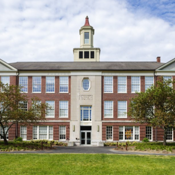
"The Umbrella Arts Center" captures the breadth of arts that thrive in one location. While we remain anchored at 40 Stow Street, our new brand acknowledges that our nonprofit mission stands within and apart from our physical location.
After all, though our work remains centered within our lively building, you’ve likely also experienced it at an outdoor gallery near Walden Woods, in the pages of a print-at-home education guide, in the streamed video of a post-show discussion, and in the career of the artist who got their start or latest inspiration here.
“Umbrella Arts” keeps our identity clear and puts the emphasis on the Arts themselves: it’s who we are and what we do.
Leaving our mark
Our evolution needed a new brand mark that felt distinctly ours: artistic, warm, and human. The new mark is a loose, confident script, "Ua," that reads like an artist’s signature on a finished work. It's playful without losing legibility, scales gracefully, and focuses on our artistic identity.
We paired the mark with the Acumin font suite as our primary typeface — clean, confident, bold, modern, versatile, and legible.
A palette with purpose
Color matters as much as form. We moved from our original multicolor scheme to a focused gradient: orange fading into purple through a flash of magenta.
The logic is simple but meaningful. Orange carries our bold, passionate daytime energy (classes, workshops, gallery visits), while deep purple holds the creative, sophisticated mood of our evenings (concerts, performances, opening nights). It's one palette that holds the full range of what happens under our roof, day and night, with the brighter pink representing moments of inspiration, connection, and joy.
Why this all matters
For us, the strength of our brand is in both its ability to be recognized anywhere and represent all that we do. We now have a unified system of tools that carries our expansive identity across print and digital formats. Whether you first find us on Instagram or on a sandwich board on Stow Street, you’ll recognize one vibrant organization.
Our building, mission, and community are still here and thriving, unified by a fresh, evolved brand. We can’t wait to show you what all this looks like out in the world, and on the new website when it launches next year. (That website will have the same address with our updated look and a more intuitive user experience: stay tuned!)
As always, thank you for being a part of Umbrella Arts. We’re excited to share this next era in our story as Concord’s interdisciplinary arts hub!
Warmly,
Eileen Williston
Executive Director, Umbrella Arts